Adding game feel - Improve My Game Jam #11
Following ideas from talks like Juice it or lose it or Best Practices for fast game design in Unity, the plan for this weekend was to add better game feel to my board game "Ultimate Dots and Boxes".
Friday - 25.09.2020
On the first day of the game jam, while all package updates and the newly installed URP and MMFeedbacks, I translated the text to German and French. This was a long-standing todo and I had nothing else to do while the downloads ran. The localization package proved to be easy to handle. Since there are not many texts to translate in the game, I finished the translations in less than two hours. For French, which I speak on a basic level, I utilized DeepLto translate.
After finishing the translations, the next task was to polish the menu animations. Specifically how windows appear and disappear, as well as scene switching. I loved the animations from the game Minesweeper - The Clean One, which inspired me for my animations. Using DoozyUI as my UI management tool, this change was relatively easy. The scene switching animation proved to be more tricky.
In Ultimate Dots and Boxes, there is only the main menu and the game scene. To be faster when switching scenes, you would naturally preload the scene and activate it when needed. But there is a bug in Unity's SceneManager - when you preload the next scene while the current scene is still loading, the current scene is skipped and the next scene is loaded instead. Luckily this is fixed by preloading the next scene half a second later than the first Start call. This way, all the scene transitions seemed smooth.
And that was it for Friday. The game feel is better in the menu, but the game is still lacking.
Saturday - 26.09.2020
I'll say it straight up, I did not like the way the game looked.

But could not say what it was, it was just a general feeling. Listing all the changes I made, we have
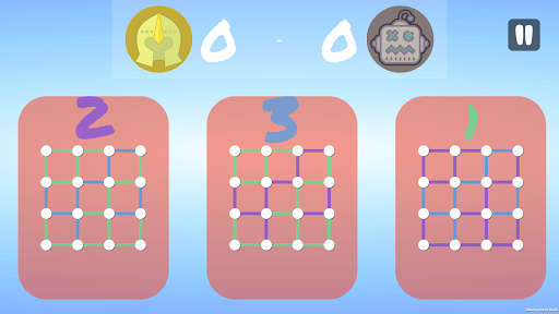
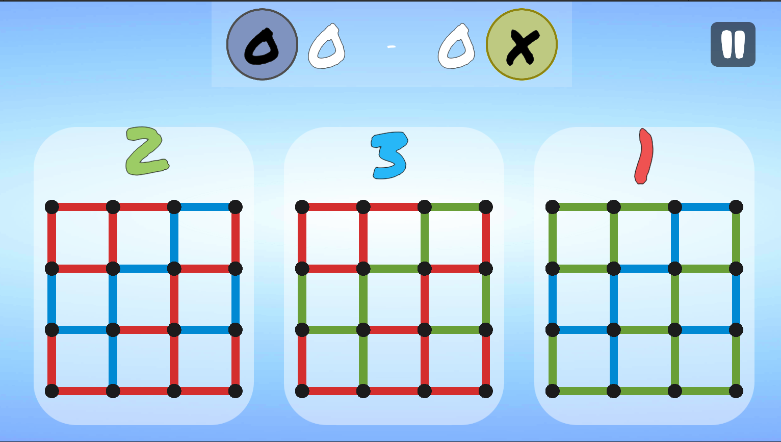
- Reduce the size of the white dots. The player's focus should be on the lines, not on the dots.
- Decrease the score widget's size.
- Increase the map size.
- Change the background color of the boards to transparent white.
- Change the overall color palette for better accessibility.
- Remove the weird player icon with markers "o" and "x".
After all the changes, the game board looked like this

Still not 100% happy because I can't figure out a nice way of visualizing the lines. But it looks much better in my opinion than the last version. After that it basically was playing around with post processing effects to let the player feel the impact she has.
Sunday - 27.09.2020
This day was basically clean up of the project by using Unity Atoms Scriptable Objects. This way, the GameObjects are beautifully decoupled and communicate over events that are easy to debug. For anyone interested, I recommend the talk by Ryan Hipple on this topic. Compile, build, upload and write this devlog.
Ultimate Dots and Boxes
Update of the classic pencil and paper game
| Status | Released |
| Author | creativecodecampus |
| Tags | 2D, Board Game, logic |
Leave a comment
Log in with itch.io to leave a comment.